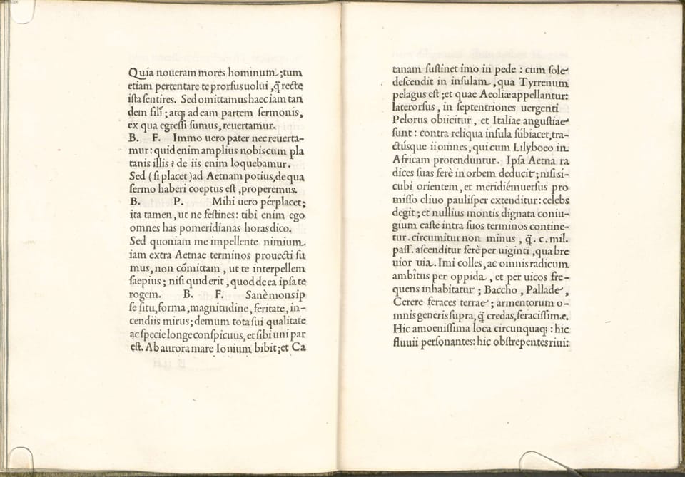
Garamond and timeless beauty

Hello, this is Kris, the budding author of Typographic North.
My journey is progressing at the pace of a glacier. I travel slowly. I take in the sights, I reflect, I plan. After all, I’m mastering an old ship. It takes time. The creation of beauty, after all, is a pursuit that demands meticulous attention to detail, an unwavering commitment to refinement, and a profound respect for tradition. This glacial pace is a reflection of the enduring nature of beauty itself. True beauty, you see, is timeless. It withstands fleeting trends and fads, persisting through the ages.
Just like Garamond.

For me, the Garamond has been the standard classical typeface for any project that does not demand a prominent style. This is not to say that Garamond is bland in any way, or that it doesn’t have a style in itself, I’m just pointing to the timelessness in its form. It’s been around since the late 1400s in various incarnations, the roman and the italic have been refined and experimented with a lot, but the general expression is still with us and works very well in books and other long texts.
When I was in design school, Garamond – or to be more precise; Adobe Garamond Pro – was put forward as the go-to typeface for a classical look, and that established truth still lasts for me today. There were alternatives on offer, of course, some more adventurous than others. Granjon, Sabon, Galliard, Bembo etc. were all thoroughly well-designed garaldes commonly used and well-tested in print. However, Garamond was the ruler of them all, and what my typography teacher held forth as an ideal. It was so prevalent that it became a staple, almost ubiquitous. It became a bore. Which is a shame, because the teacher who took this stance was right. Garamond is a beautiful, timeless piece of type design, embodying a quality that emerges only with careful refinement through time. If unsure, go with Garamond.

Let’s examine some layman’s typefaces, available to all: Arial, Verdana, Georgia, Courier, and the one that surely is the epitome of ubiquitousness: Times New Roman. This is the one that truly has saturated the pages of students, businesses and institutions the world over. Established as the «professional» font of choice it commands a certain respect, but because it is so prevalent it also has that quality of boredom and laziness to it. A pity, for looking at Times reveals all those signs of timeless beauty to be present.
However, if I’d like to be in that Times territory, I go with something adjacent, such as Plantin (of Monocle fame). It precedes Times New Roman chronologically but has all the qualities of a great book face and even a delightful quirkiness that gives it character.

But why use Times when Garamond in various forms is readily available? Surely it's a much more balanced and beautiful typeface without the quasi-academic baggage that Times New Roman carries with it.
And why use anything other than Garamond when Garamond exists? Well, let's save those discussions for later.
Every year sees great releases of old-style serifs, revivals of Renaissance antiquas and other great typefaces for longer texts. Only time will tell if they last. And time has told the world that Garamond is close to everlasting.
So, let us not bemoan the glacial speed of good design (nor my publishing frequency). Instead, let us savour the unhurried elegance that emerges from this patient and deliberate journey.

